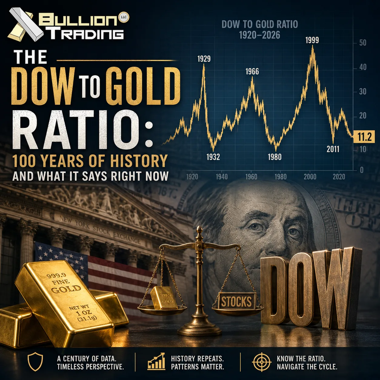
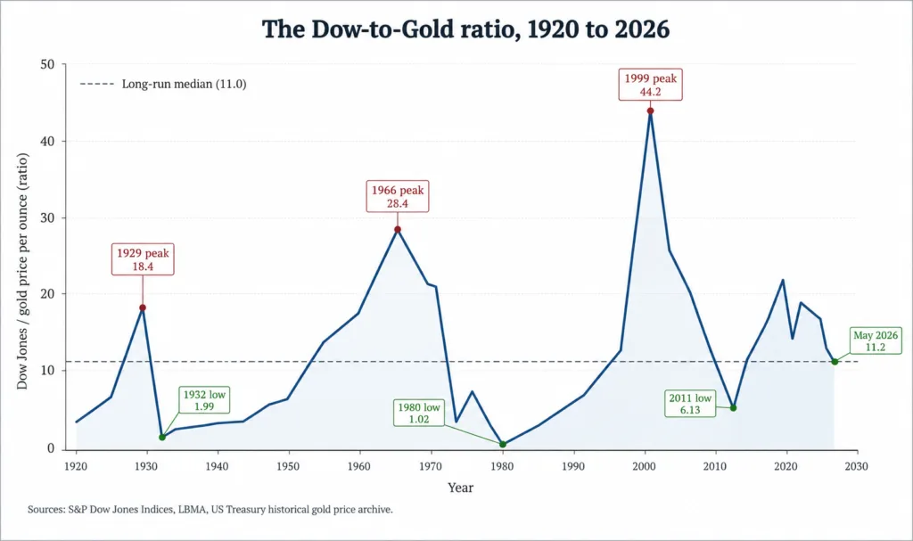
On May 22, 2026, the Dow Jones Industrial Average closed at 50,580. The day before, an ounce of gold settled near $4,504. Divide one by the other and you get about 11.2, the modern reading of the Dow to Gold ratio. That single number, the count of gold ounces it takes to buy a notional share of the Dow, has been tracked by investors for more than a century, and its swings have lined up almost too neatly with the biggest turning points in financial history.
The metric is simple, which is half of why it has stuck around. You divide the Dow’s price by the per-ounce price of gold. There is no inflation adjustment, no discount-rate assumption, no analyst projection. It is a ratio of two things people have priced honestly for decades. When the number rises, paper assets are winning. When it falls, hard money is winning. The historical record suggests these two states do not balance out in any tidy annual sense. They alternate in long cycles, sometimes thirty years long, and the inflection points are the moments most worth paying attention to.
A century of swings
The ratio’s modern history begins in the late 1920s. By September 1929, the Dow had pushed the reading near 19, the highest level it had ever held. Within three years, after the Crash of 1929 and the early phase of the Great Depression, the ratio collapsed to roughly 1.94 in February 1933. That figure was not just a statistical low. It described a world in which a single ounce of gold (then fixed at $20.67) was worth almost the same as the entire Dow. The Roosevelt administration’s response came in two steps: Executive Order 6102 in April 1933 required Americans to hand in gold at the $20.67 official price, and the Gold Reserve Act of January 1934 then revalued gold to $35 an ounce, instantly devaluing the dollar and resetting the cycle’s starting line.
The next major peak landed in February 1966 at roughly 28. The post-war boom had carried equities through more than two decades of gains while gold was still pegged at $35 under the Bretton Woods system, so the ratio had nowhere to go but up. When the peg eventually broke after the Nixon Shock of 1971, gold was free to find its own level. Find it it did. On January 21, 1980, after a decade of stagflation, oil shocks, and double-digit inflation, gold hit its London afternoon fix at $850 an ounce while the Dow traded near 840. The ratio briefly touched 1.29, the lowest reading of the modern era.
What followed was the longest uptrend on record. Paul Volcker’s interest-rate medicine cooled inflation, the dollar regained credibility, and equities entered a generational bull market while gold drifted through a twenty-year sideways grind. By the height of the dot-com bubble in mid-1999, the Dow was above 11,000 and gold had slumped to roughly $250. The ratio crested at about 43, an all-time record. According to data published by MacroTrends, no peak in either direction has come close since.
The reversal was just as dramatic. Through the 2000s, gold ran from $250 to $1,900 while equities went through two recessions and a financial crisis. By late summer 2011, with gold spiking to $1,895 and the Dow trading near 11,500, the ratio compressed to roughly 6. From that point the relationship turned again. The Federal Reserve’s quantitative easing programs and a long stretch of low rates pushed the Dow to fresh highs while gold spent five years in a bear market. By September 2018 the ratio had clawed back above 22, and many strategists at the time were calling the start of another multi-decade equity dominance.
That call has not aged well. The 2020 pandemic shock, the inflation surge of 2021 to 2023, two regional banking scares, and a steady reweighting of foreign central-bank reserves toward gold combined to put the ratio back into a downtrend almost as soon as it had reset. According to figures published in the World Gold Council’s full-year 2024 demand trends, central banks bought roughly 1,045 tonnes of gold in 2024, the third consecutive year above the 1,000-tonne mark, the first such streak since the 1950s. Buying eased to 863 tonnes in 2025 but remained well above the long-run average.
Where 2026 fits in
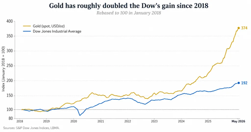
The current reading near 11 is interesting precisely because it does not fit cleanly into either pattern. It sits well below the 22 to 43 zone that marks late-cycle equity euphoria, and well above the 1 to 2 readings that have historically marked generational stock-market bottoms. The ratio has been compressing steadily since 2018, driven by gold’s run from roughly $1,200 to above $4,500. According to monthly data from the Federal Reserve Bank of St. Louis, the Dow has roughly doubled over the same period, but gold has nearly quadrupled.
Bulls on the ratio (which usually means bulls on equities) argue that the current compression is a healthy reset. Corporate earnings have grown, the dollar remains the world’s reserve currency, and gold’s surge to record highs above $4,500 is largely a function of central-bank buying and geopolitical hedging rather than collapsing US fundamentals. From that perspective, 11 is a pause, not a warning, and the long-term trend remains pointed back toward the high teens.
Bears read the same chart differently. They point out that since 1900, every major bull cycle in equities has ended with the ratio reverting toward 1 or 2, not toward 11. The 1932 and 1980 lows were not just statistical curiosities. They were moments when the broad public concluded that the financial system needed to be reset. The bears note that US federal debt has crossed $39 trillion, that the Fed’s balance sheet remains historically bloated, and that foreign central banks have been net buyers of gold for sixteen consecutive years according to the World Gold Council’s quarterly demand trends report. If the ratio is truly mean-reverting, a move from 11 toward the low single digits would imply either a sharp leg lower in the Dow, another doubling or tripling in gold, or some combination of both.
The ratio’s quieter cousins
The Dow to Gold ratio is not the only valuation gauge worth watching, and reading it in isolation is a mistake. Two cross-checks tend to sharpen the picture. The first is the CAPE ratio, which compares the S&P 500 to its ten-year inflation-adjusted earnings. CAPE crossed 39 in 2025, a level seen only at the dot-com peak of December 1999 (when it touched roughly 44) and briefly during the post-pandemic surge of 2021. The 1929 reading, by contrast, peaked closer to 33, so 1929 was not in fact as expensive on this measure as today. The CAPE 1999 peak preceded a major contraction in the Dow to Gold ratio, from above 40 to below 7 over the next decade. The fact that CAPE now sits near record highs while the Dow to Gold ratio sits in mid-range is itself an unusual signal. One of them is probably wrong.
The second cross-check is the gold-to-silver ratio, which behaves like a sentiment gauge inside the precious-metals complex. Silver tends to outrun gold in the late stages of a metals bull market, and that phase has historically coincided with the late stages of Dow to Gold compression. Watching both ratios at once gives a clearer read on whether the move in gold is methodical institutional positioning or full retail euphoria.
What investors actually do with it
In practice, very few investors use the Dow to Gold ratio as a timing signal. It is too slow. The 1999 peak took thirteen years to fully invert, and the post-2011 reversal lasted seven years before turning again. What the ratio is useful for is calibration. If your portfolio assumed in 2018 that gold would forever be a 5 percent footnote, the ratio’s halving since then is a prompt to think about whether that allocation still makes sense. Research compiled by the World Gold Council’s 2025 edition of gold as a strategic asset places the historical sweet spot for gold in a balanced US portfolio between 5 and 15 percent depending on rates and inflation regime. The higher end of that range has tended to outperform when the Dow to Gold ratio is compressing.
A second practical use is as a rebalancing prompt. Investors who began the cycle with a 70/30 stocks-to-gold split in 2018 are now likely closer to 55/45 simply because of price moves, even without buying or selling. Letting the ratio do the work, in other words, has been a strategy of its own. The discipline of trimming the winner and topping up the laggard tends to feel uncomfortable in real time, especially when the laggard happens to be the asset class that has been outrunning everything else for three years. Yet that is precisely the moment the ratio is built to flag.
There is one caveat worth flagging. The Dow itself has changed. Today’s index is dominated by industrials and a few tech-adjacent names, and its composition is materially different from the 30 stocks that defined it in 1929 or even 1999. Some analysts argue that comparing the modern Dow to gold is no longer apples to apples. The counterargument is that the Dow’s purpose has always been to summarize the largest pieces of corporate America, and however that group has rotated over time, the underlying question remains the same: is paper wealth gaining ground against physical wealth, or losing it?
What the ratio is telling us now
The reading of 11 in May 2026 is not a generational extreme in either direction. It sits closer to the long-run median than to either tail. Read narrowly, that suggests neither asset class is screaming bargain or bubble. Read in context, with the Federal Reserve’s H.4.1 release still showing a balance sheet of $6.7 trillion as of late May 2026 and central-bank gold purchases at multi-decade highs, the more honest reading is that the ratio has been working its way lower for eight years now without showing any sign of fatigue. Whether that journey ends at 8, at 4, or somewhere closer to 1 is the question the next phase of the cycle will answer.
Long-term holders of physical bullion tend to watch the ratio for the same reason sailors watch the barometer. It does not predict the storm. It only tells you what direction the pressure is moving. Right now, the pressure has been moving in one direction for a long time.